TYPOGRAPHY AND HYPERTEXTUALITY - EXERCISES
28th August 2017 - 30th September 2017 ( Week 1 to Week 5 )
Gan Pei Jane ( 0327622 )
Typography and Hypertextuality - Exercises
Lecture/ Tutorial 3 - Week 3: Basic Lecture
I came into Interactive Multimedia Design late due to Student Central processing problems in University so I had to start late. It is already Week 3, the third week that students in class have started their exercises. On the first day of Typography and Hypertextuality, I was told by Mr. Vinod to complete Horizontal lines, Vertical lines and Circles on a piece of graph paper. Whilst other students are expected to fill an entire graph paper with either Horizontal lines, Vertical lines and Circles, I was only told to fill in 3 cells of all the lines and circles that are required to do since I arrived late to class. Another exercise that we did during Lecture/ Tutorial 3 is making a gif out of your name. We were given a few hours to complete the gif, then show it to Mr. Vinod for approval.
For this lecture, we were taught how to animate illustrations. Firstly, we have to make a few sketches of our names that best describes our personality. Then, we will have to trace out our sketches into Adobe Illustrator. After doing this, Mr. Vinod taught us how to animate the illustration using Adobe Photoshop.
After the lecture, our class was assigned to create typography designs for 6 different words: noisy, hollow, jumbo, dig, crooked and deep.
Lecture/ Tutorial 4 - Week 4: Typography Anatomy
We learned about the characteristics and anatomies of letterforms. Alike humans, letters have specific names for their labelled parts too and the appropriate name for this is "lexicon".

A full set of typeface will contain more than 26 letters, numerals and then symbols. When working with fonts, we have to make sure that the fonts are suitable for the occasion.
Classic fonts without any decorations or flamboyancy are the ones most used in order to provide a clean, easily readable and aesthetically pleasing work to read and look at. Mr. Vinod mentions that a good font is a font that a person can read with ease.
For the class exercise, we have to animate one the 6 words that were given from the previous week's lecture.
Instructions:
The lettering font that I have chosen for my final piece is "Blackletter". Here's an example of the Blackletter font:


2. Lettering
For this exercise, we are required to make a few sketches for our names that best describes us.


3. Type Expression
This exercise is given in Week 3. The words given to express using Adobe Illustrator are noisy, hollow, jumbo, dig, crooked and deep.


--------------------------------------------------------------------------------------------------------------------------
Feedback:
Week 3:
I just entered Typography and Hypertextuality class this week and Mr. Vinod have prescribed me several exercises that I have missed in the previous weeks - a Calligraphy exercise, a Lettering exercise and a Type Expression exercise. For the calligraphy exercise, he told me to do 3 rows of Vertical lines, Horizontal lines and Circles on a piece of graph paper, A to Z in calligraphic form on graph papers and a final 3 to 4 line poem or quote using the calligraphy font chosen on a piece of white paper.
Week 4:
I finally done some of the exercises given by Mr. Vinod from Week 1 to 3 and have shown them to Mr. Vinod. Mr. Vinod commented that the context behind my Lettering was not suitable for the Lettering design that I have created and should come out with a more liable context to suit my Lettering design. I told Mr. Vinod that my Lettering was designed with the meaning of "transition" in mind. More like a life transition choice but when he thinks about transitions, he thinks about Circles and not the Triangles that I have implemented into my design.
In the Type Expression exercise, Mr. Vinod also commented that the meaning of the words is shown subtly in my design but he says that it would look better if it was more exaggerated. I have only used one font for the 6 words but I should use a wider variety of fonts given so that the meaning of the words can be shown much clearly. After making amendments to my 6 words, Mr. Vinod says that it is okay to proceed to make an animation. I chose the word "Hollow" as the word to make an animation.
For the Calligraphy exercise, Mr. Vinod says that my words are too large and I should practice writing it smaller so I can write better for the final piece of the quote chosen.
--------------------------------------------------------------------------------------------------------------------------
Reflection:
1. Experience
Week 3: I have just entered the first class for Typography and Hypertextuality. It was quite an interesting subject as I have never studied or researched Typography and Hypertextuality before. As I was a late and new student, I was pretty confused about the things that takes place around this class. Before I knew it, I was asked to draw my name out on a piece of blank paper, creating a design that best suits my personality and then transferring it into Adobe Illustrator. That was also my first time using Adobe Illustrator so it was confusing to me. I took some time to play around with the tools and eventually managed to get a design almost similar to the one drawn on the piece of paper. Then, I was asked to create an animation using the design I have created and Mr. Vinod and Mr. Jeff have taught us how to create the animation using Photoshop.
Week 4: It was difficult for me to create 6 different designs for 6 words with such a short amount of time in regards to the rules of non-distortion and bending or adding of any elements to express the meaning of the words. After playing around with different fonts given, I manage to create the design for the 6 words given. While it was interesting, it was certainly tiring for me as I had to cramp all 5 weeks worth of work into 2 weeks in order to catch up with the deadline on Week 5.
2. Observation
Week 3: While doing Calligraphy for the first time, I realized that I was not used to holding the calligraphy pen in a way that is proper in order to make certain flicks or strokes that the fonts needed. I realized that holding your calligraphy pen in a certain straighter angle will make your words look better as the pen that I am using is a flat nib pen. I had to train my hand in order to work in an angle that best suits the calligraphy font style that I was practicing on. While doing Lettering, I was not used to the software as it was my first time using it and I had to ask Mr. Jeff for guidance on how to make my illustration look better and more aligned. Some tools in the Adobe Illustrator software can help easily align and make my designs look more presentable.
Week 4: For Type Expression, I had problems downloading the fonts needed for the exercise, but managed to download the fonts in the end and had used some time experimenting on the fonts and design that best suits the 6 words given. I find that with practice, I get more used to using the Adobe Illustrator software.
3. Findings
Week 3: I have took note on the flow of ink with the type of paper used. A graph paper will be different from a blank white paper in terms of flow and fluidity of ink on the paper. As a graph paper has more bumps and lines, it restricts certain ink flows on the paper as compared to a blank white paper. Certain angles used to hold the pen will also create a different outcome for the calligraphy. Drawing lines on a piece of white paper as a guideline for calligraphy will help with alignment and accuracy of the letters that will be written on the paper.
Week 4: For Lettering and Type Expression, at first, I felt restricted to a certain way of designing, but then I find that I have to be more experimental and messy with my ideas and less "straight minded" when designing.
--------------------------------------------------------------------------------------------------------------------------
Book of the Week:
Week 3:
Typographic Universe by Steven Heller & Gail Anderson


This book consists of compiled typography artforms derived from either nature, built environments and also human creation. While other typography books consists of sketches, this book mainly consists of unique photos and artworks inspired by natural and built environments.


Week 4:
Typography Sketchbooks by Steven Heller & Lita Talarico


This book consists of a series of typographical illustration and sketches in varied and personal styles from various artists.
"Every designer, regardless of race, creed or nationality, understands the language of type. A graphic designer who is not fluent is not a graphic designer."
There are two kinds of type makers, one is percisionist or functional designer who creates typefaces for quotidian public consumption, the other is an expressionist designer who creates letterforms in any shape of form that emotes. The designer here agrees that their sketchbooks are aide-memoires for ideas that would otherwise be forgotten, but we view these type of sketchbooks as having one thing in key thing in common, they are personal narratives, not conventional stories but tales about form and content. Through sketches and finished letterforms, we see how typographers and type designers address the vessel in which meaning is contained.
"These books help me very much with a clear overview and insight into my past self. Every now and then I take one or two days off and take every journal, almost page by page, to see who I was, what I was thinking and how everything relates to this moment I've created for myself." - Ovidiu Hrin
Here are some examples of typography sketching by artists extracted from Typography Sketchbooks:


Gan Pei Jane ( 0327622 )
Typography and Hypertextuality - Exercises
Lecture/ Tutorial 3 - Week 3: Basic Lecture
I came into Interactive Multimedia Design late due to Student Central processing problems in University so I had to start late. It is already Week 3, the third week that students in class have started their exercises. On the first day of Typography and Hypertextuality, I was told by Mr. Vinod to complete Horizontal lines, Vertical lines and Circles on a piece of graph paper. Whilst other students are expected to fill an entire graph paper with either Horizontal lines, Vertical lines and Circles, I was only told to fill in 3 cells of all the lines and circles that are required to do since I arrived late to class. Another exercise that we did during Lecture/ Tutorial 3 is making a gif out of your name. We were given a few hours to complete the gif, then show it to Mr. Vinod for approval.
For this lecture, we were taught how to animate illustrations. Firstly, we have to make a few sketches of our names that best describes our personality. Then, we will have to trace out our sketches into Adobe Illustrator. After doing this, Mr. Vinod taught us how to animate the illustration using Adobe Photoshop.
After the lecture, our class was assigned to create typography designs for 6 different words: noisy, hollow, jumbo, dig, crooked and deep.
Lecture/ Tutorial 4 - Week 4: Typography Anatomy
We learned about the characteristics and anatomies of letterforms. Alike humans, letters have specific names for their labelled parts too and the appropriate name for this is "lexicon".

Fig. 1 Example of letterform anatomy.
A full set of typeface will contain more than 26 letters, numerals and then symbols. When working with fonts, we have to make sure that the fonts are suitable for the occasion.
Classic fonts without any decorations or flamboyancy are the ones most used in order to provide a clean, easily readable and aesthetically pleasing work to read and look at. Mr. Vinod mentions that a good font is a font that a person can read with ease.
For the class exercise, we have to animate one the 6 words that were given from the previous week's lecture.
Instructions:
The lettering font that I have chosen for my final piece is "Blackletter". Here's an example of the Blackletter font:

Fig. 2 Blackletter font.

Fig. 3 Attempt on Vertical lines, Horizontal lines and Circles.

Fig. 4 First attempt on Vertical lines, Horizontal lines and Circles.

Fig. 5 Second attempt on Circles after Mr. Vinod's feedback.

Fig. 6 Black Letter Font practice.

Fig. 7 Practice A - J

Fig. 8 Practice K - T

Fig. 9 Practice U - Z

Fig. 10 Practice Lines and Circles.

Fig. 11 Practice alphabets.

Fig. 12 Practice finals

Fig. 13 Final piece for Calligraphy using Blackletter font.
2. Lettering
For this exercise, we are required to make a few sketches for our names that best describes us.

Fig. 14 Drawing name.
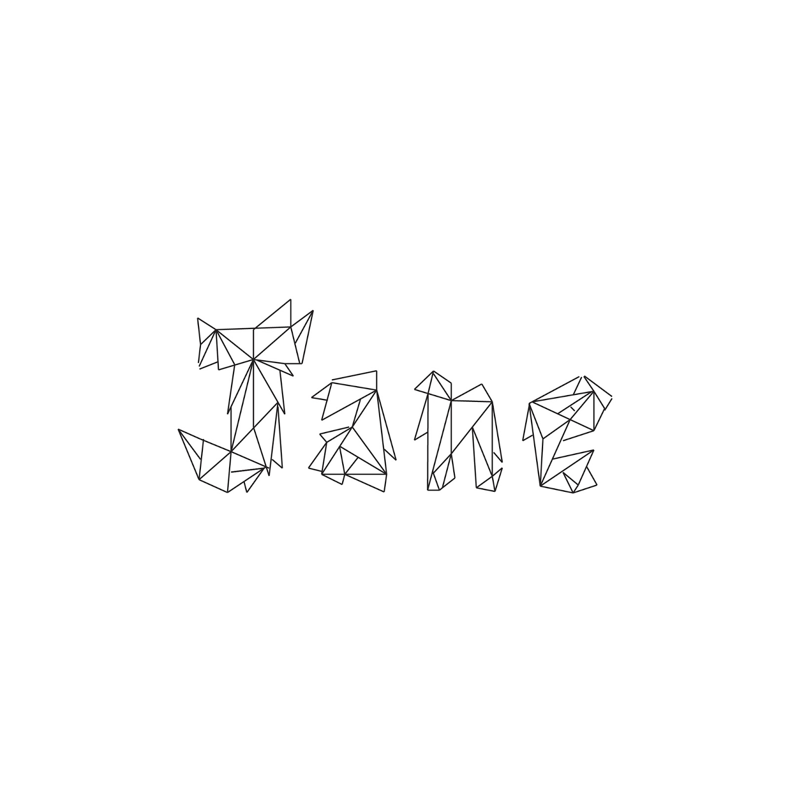
Fig. 15 Final name piece drawn in Adobe Illustrator.
The GIF animation frame:

Fig. 16 GIF animation frame.
Here's the GIF designed based on my name and personality:

Fig. 17 The name design shows the construction and deconstruction of my name, this reflects my personality in a way that I have experienced things in my life - building relationships and goals and losing things along the way but always finding my way back in life as I have wanted it to be. As I find life not to be easy, I have implemented a sharp, hard edged design into my illustrated name.
This exercise is given in Week 3. The words given to express using Adobe Illustrator are noisy, hollow, jumbo, dig, crooked and deep.

Fig. 18 Illustrated words.
Here is the animated GIF designed for the word "Hollow":

Fig. 19
--------------------------------------------------------------------------------------------------------------------------
Feedback:
Week 3:
I just entered Typography and Hypertextuality class this week and Mr. Vinod have prescribed me several exercises that I have missed in the previous weeks - a Calligraphy exercise, a Lettering exercise and a Type Expression exercise. For the calligraphy exercise, he told me to do 3 rows of Vertical lines, Horizontal lines and Circles on a piece of graph paper, A to Z in calligraphic form on graph papers and a final 3 to 4 line poem or quote using the calligraphy font chosen on a piece of white paper.
Week 4:
I finally done some of the exercises given by Mr. Vinod from Week 1 to 3 and have shown them to Mr. Vinod. Mr. Vinod commented that the context behind my Lettering was not suitable for the Lettering design that I have created and should come out with a more liable context to suit my Lettering design. I told Mr. Vinod that my Lettering was designed with the meaning of "transition" in mind. More like a life transition choice but when he thinks about transitions, he thinks about Circles and not the Triangles that I have implemented into my design.
In the Type Expression exercise, Mr. Vinod also commented that the meaning of the words is shown subtly in my design but he says that it would look better if it was more exaggerated. I have only used one font for the 6 words but I should use a wider variety of fonts given so that the meaning of the words can be shown much clearly. After making amendments to my 6 words, Mr. Vinod says that it is okay to proceed to make an animation. I chose the word "Hollow" as the word to make an animation.
For the Calligraphy exercise, Mr. Vinod says that my words are too large and I should practice writing it smaller so I can write better for the final piece of the quote chosen.
--------------------------------------------------------------------------------------------------------------------------
Reflection:
1. Experience
Week 3: I have just entered the first class for Typography and Hypertextuality. It was quite an interesting subject as I have never studied or researched Typography and Hypertextuality before. As I was a late and new student, I was pretty confused about the things that takes place around this class. Before I knew it, I was asked to draw my name out on a piece of blank paper, creating a design that best suits my personality and then transferring it into Adobe Illustrator. That was also my first time using Adobe Illustrator so it was confusing to me. I took some time to play around with the tools and eventually managed to get a design almost similar to the one drawn on the piece of paper. Then, I was asked to create an animation using the design I have created and Mr. Vinod and Mr. Jeff have taught us how to create the animation using Photoshop.
Week 4: It was difficult for me to create 6 different designs for 6 words with such a short amount of time in regards to the rules of non-distortion and bending or adding of any elements to express the meaning of the words. After playing around with different fonts given, I manage to create the design for the 6 words given. While it was interesting, it was certainly tiring for me as I had to cramp all 5 weeks worth of work into 2 weeks in order to catch up with the deadline on Week 5.
2. Observation
Week 3: While doing Calligraphy for the first time, I realized that I was not used to holding the calligraphy pen in a way that is proper in order to make certain flicks or strokes that the fonts needed. I realized that holding your calligraphy pen in a certain straighter angle will make your words look better as the pen that I am using is a flat nib pen. I had to train my hand in order to work in an angle that best suits the calligraphy font style that I was practicing on. While doing Lettering, I was not used to the software as it was my first time using it and I had to ask Mr. Jeff for guidance on how to make my illustration look better and more aligned. Some tools in the Adobe Illustrator software can help easily align and make my designs look more presentable.
Week 4: For Type Expression, I had problems downloading the fonts needed for the exercise, but managed to download the fonts in the end and had used some time experimenting on the fonts and design that best suits the 6 words given. I find that with practice, I get more used to using the Adobe Illustrator software.
3. Findings
Week 3: I have took note on the flow of ink with the type of paper used. A graph paper will be different from a blank white paper in terms of flow and fluidity of ink on the paper. As a graph paper has more bumps and lines, it restricts certain ink flows on the paper as compared to a blank white paper. Certain angles used to hold the pen will also create a different outcome for the calligraphy. Drawing lines on a piece of white paper as a guideline for calligraphy will help with alignment and accuracy of the letters that will be written on the paper.
Week 4: For Lettering and Type Expression, at first, I felt restricted to a certain way of designing, but then I find that I have to be more experimental and messy with my ideas and less "straight minded" when designing.
--------------------------------------------------------------------------------------------------------------------------
Book of the Week:
Week 3:
Typographic Universe by Steven Heller & Gail Anderson


Fig. 20 & 21

Fig. 22 Using rulers to create alphabets.

Fig. 23 Photography of bicycles parts can help create the illusion of a letterform.

Fig. 24 Furnitures made by structural form of Kanji.
Typography Sketchbooks by Steven Heller & Lita Talarico


Fig. 25 & 26
"Every designer, regardless of race, creed or nationality, understands the language of type. A graphic designer who is not fluent is not a graphic designer."
There are two kinds of type makers, one is percisionist or functional designer who creates typefaces for quotidian public consumption, the other is an expressionist designer who creates letterforms in any shape of form that emotes. The designer here agrees that their sketchbooks are aide-memoires for ideas that would otherwise be forgotten, but we view these type of sketchbooks as having one thing in key thing in common, they are personal narratives, not conventional stories but tales about form and content. Through sketches and finished letterforms, we see how typographers and type designers address the vessel in which meaning is contained.
"These books help me very much with a clear overview and insight into my past self. Every now and then I take one or two days off and take every journal, almost page by page, to see who I was, what I was thinking and how everything relates to this moment I've created for myself." - Ovidiu Hrin
Here are some examples of typography sketching by artists extracted from Typography Sketchbooks:

Fig. 27

Fig. 28

Fig. 29

Fig. 30

Fig. 31
Comments
Post a Comment