TYPOGRAPHY AND HYPERTEXTUALITY - FINAL PROJECT
1 November 2017 - 15 November 2017 (Week 9 - Week 11)
Gan Pei Jane (0327622)
Typography & Hypertextuality
Kinetic Typography
Lecture/Tutorial 12:
22nd November 2017 (Week 12)
In week 12, we learn how to introduce paragraphs, highlight text and use print.
To indicate paragraphs:
1. Pilcrow
2. Indentation
3. Extending
Characteristics of a paragraph:
1. Line spacing
2. Leading
If the line spacing and leading are the same, you will have cross alignment. For indentation, it is preferable if we used left justified text to make everything look good. We cannot use indentation in conjunction with line spacing.
Here are examples of a type of error that we would want to avoid while designing:
1. Orphan
This is a line of text that is left in the start of a new column.
2. Widow
This is a line of text that is left in the last column.
To highlight text:
1. Italics
2. Bold
3. Colour
4. Changing the highlighted text to Sans Serif fonts or Serif fonts.
5. Numbers
6. Bullets
7. Highlight box
8. Quotation marks
We can reduce the size of the words by 0.5pts if it is too bold, this can also apply to numbers, if we decided to use numbers in our text, we can reduce the number size by 0.5pts if it looks too large. If we decided to highlight text by changing to a Sans Serif or Serif font, we should use a Sans Serif font if the original font is a Serif font and vice versa.
For print:
1. CMYK: Cyan, Magenta, Black and Yellow.
2. Pantones: Any colour of your choice or Black.
Lecture/Tutorial 13:
29th November 2017 (Week 13)
No lecture for this week.
_________________________________________________________________________________
Project:


Feedback:
Gan Pei Jane (0327622)
Typography & Hypertextuality
Kinetic Typography
Lecture/Tutorial 12:
22nd November 2017 (Week 12)
In week 12, we learn how to introduce paragraphs, highlight text and use print.
To indicate paragraphs:
1. Pilcrow
2. Indentation
3. Extending
Characteristics of a paragraph:
1. Line spacing
2. Leading
If the line spacing and leading are the same, you will have cross alignment. For indentation, it is preferable if we used left justified text to make everything look good. We cannot use indentation in conjunction with line spacing.
Here are examples of a type of error that we would want to avoid while designing:
1. Orphan
This is a line of text that is left in the start of a new column.
2. Widow
This is a line of text that is left in the last column.
To highlight text:
1. Italics
2. Bold
3. Colour
4. Changing the highlighted text to Sans Serif fonts or Serif fonts.
5. Numbers
6. Bullets
7. Highlight box
8. Quotation marks
We can reduce the size of the words by 0.5pts if it is too bold, this can also apply to numbers, if we decided to use numbers in our text, we can reduce the number size by 0.5pts if it looks too large. If we decided to highlight text by changing to a Sans Serif or Serif font, we should use a Sans Serif font if the original font is a Serif font and vice versa.
For print:
1. CMYK: Cyan, Magenta, Black and Yellow.
2. Pantones: Any colour of your choice or Black.
Lecture/Tutorial 13:
29th November 2017 (Week 13)
No lecture for this week.
_________________________________________________________________________________
Instructions:
_________________________________________________________________________________
Project:
Final Project (Week 12) – Kinetic Typography (Design)
Requirements:
- Adobe Illustrator
- Adobe Illustrator
Firstly, I will have to do some visual research on the type of poster I want to design.
Initially, I wanted to design a poster for a ballet event, but after the initial feedback of Mr. Vinod, I decided to design a poster around a quote about dance.
Here are some of my attempts on the poster before coming to a finalization:

Fig. 1: First attempt.

Fig. 2: Second attempt.

Fig. 3: Third attempt.

Fig. 4: Fourth attempt.

Fig. 5: Fifth attempt.
After Mr. Vinod's guidance, he shows me several references and ideas that I could implement my design into. Here's the reference that I have decided on, based on Mr. Vinod's suggestions.


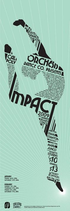
Fig. 6: Dance poster reference with human dancing silhouette.

Fig. 7: Dance poster reference with leg silhouette.
Here's my final poster design:

Fig. 8: Final Poster Design.
Here's the final GIF for the poster design:

Fig. 9: Final GIF.
_________________________________________________________________________________
Feedback:
Week 12
I initially created a poster for testing of my typeface and Mr. Vinod commented that my font looks as if it is playing second fiddle with the crude black blocks of rectangles. He mentions that my design is also very poorly presented. So I created another poster, in which he says that I should not create a ballet poster, instead, I should create a typographic poster and if I wanted to connect to a ballet theme, I should choose a quote regarding ballet instead. I also should not use black as my background due to the very thin lines of my font. I then created 4 more posters in which Mr. Vinod shows me a few posters so I can move my present design towards that direction.
Week 13
I revised my poster into the direction that Mr. Vinod has shown me. After showing Mr. Vinod my pre-finalized ballet shoe poster, he mentions that I should avoid putting the blue blocks at the background of my poster and I should instead leave the poster simple, just the ballet shoe as the main subject, and also have the name of my typeface placed on the bottom side of my poster. I placed the typeface name on the bottom right side and then continued making the gif and then show it to Mr. Shamsul and Mr. Vinod, in which they gave me the green light to finalize the poster. Mr. Vinod also mentions that my typeface name on the bottom right corner should align with the ballet shoes so that it would look better.
_________________________________________________________________________________
Reflection:
1. Experience
Overall, the poster design project is fun to do although it is difficult at times. I have attempted a few poster designs before reaching a design that I finalized. The first poster design that I had made was very poor as agreed with Mr. Vinod. After a few times of experimenting with poster designs and gaining feedback from both Mr. Vinod and Mr. Shamsul, I have finally trained myself to see the poster design in a different light that I have not before. I have also tried attempting the poster in different and more "experimental" ways than what I have originally thought my poster was going to turn out. I ended up with a ballet shoe design type poster that Mr. Vinod suggested for me to do. It is fun attempting to put in all the words to make a form or shape of a ballerina's legs. I also enjoy playing around with different colour choices in my design to make an animated colour switching poster at the end.
2. Observation
While designing the poster, I find that it is better to choose a simple design rather than making a complicated design which could potentially end up in a mess. It is also important to note that the organization of words, alignment or words, colour and other small elements also play an important role in making your poster look presentable.
3. Findings
When designing the poster, I initially wanted to design a poster for children that has a cartoon and games theme to it, but after designing the first poster, I find that the font that I have made might not suit the theme that I wanted to go for. Since my font has thicker and thinner lines, two thoughts came into my mind whilst looking at my font all typed out Illustrator, "delicate" or "ballet". I was always interested in dance or ballet so I have decided to then stick to a ballet theme on my poster using my font. After Mr. Vinod's feedback on finding a quote for my proposed theme, I found several quotes that I liked and had implemented them into my design. I have found out that when designing type posters, I should take note of the characteristics of the font that I am using on the poster and make my design elements around the font.
_________________________________________________________________________________
Book of the Week
Week 12 & 13


Book of the Week
Week 12 & 13


For this week, I decided to look at a book called New Modernist Type by Steven Heller and Gail Anderson to expand my knowledge on typography poster designs. This book portrays many types of typographical poster designs in a "modern" way.
As quoted in the book, "Old and Modern are not opposing terms. The first documented usage of the word "modern" dates back to the late 16th Century; it meant "of present and recent times" and was contrasted with "ancient". The here and now versus the there and then - that was modern. By the 19th and 20th Centuries, Modern (with a capital M) was used to designate movements in art, and modernism developed into various different groups and offshoots. When modernists cut the serpentine tendrils off art noveau objects and replaced them with curvilinear forms with right angles, the altered the landscape and the language of virtually everything in the design world, from architecture to typefaces. They believe that this would be the ultimate change, the revolution to end all revoulutions."
Comments
Post a Comment